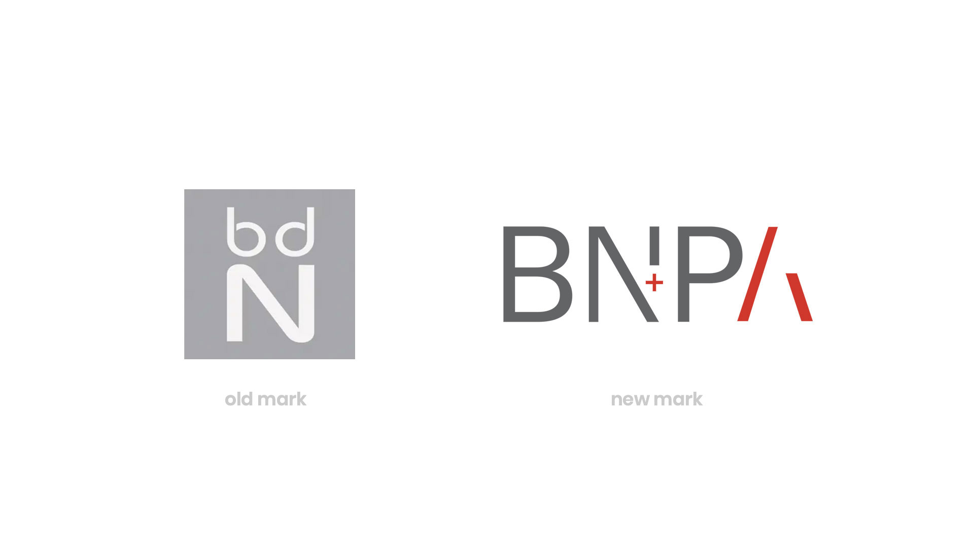
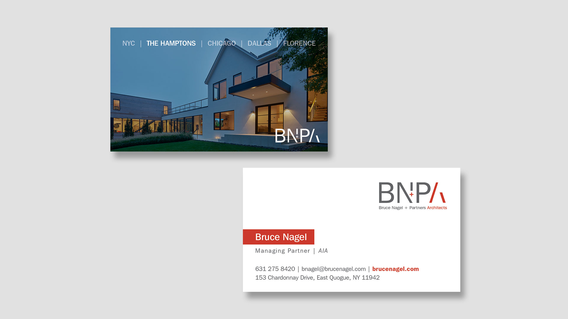
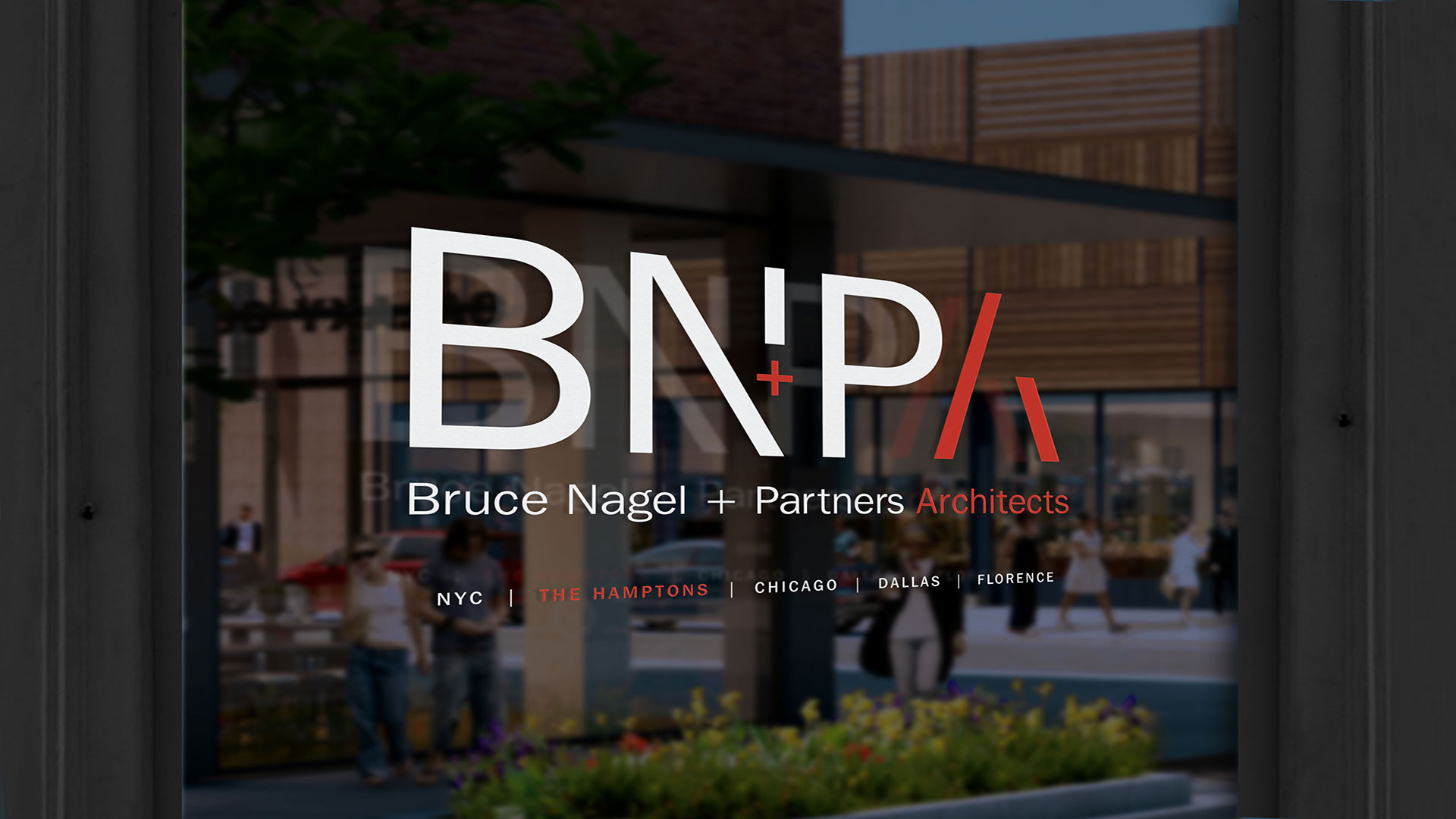
…but he also needed added function as he incorporated partners into his Hamptons based business in NYC, Chicago, Dallas and Florence, Italy. DOD first modernized the typeface and color palette of his brand, using the persimmon red as an effective accent. We highlighted the most important facets in his collateral portfolio, including the plus sign in the center of the logo, which is a subtle nod toward the collaboration of Nagel and his partner architects around the world.
Brand Identity Project